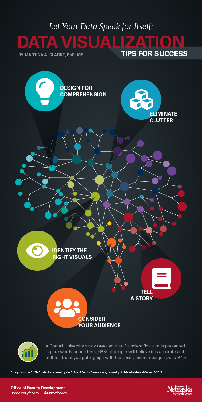
Data visualization is the graphical representation of information. It reduces large, complicated chucks of data into easily digestible visuals. Data visualization also allows you to comprehend information rapidly and easily find trends, patterns, and outliers. In addition, visualized data can hold audience interest longer, promote engagement and increase the retention of key concepts.
Design for comprehension – Create a specific message you want to communicate. Then, align the data to your message and organize it logically.
Eliminate clutter – Be succinct. Exclude redundant information, including excess text, borders, and gridlines. Avoid squeezing too much data in a small space.
Identify the right visuals – Your message needs to pair well with your design, otherwise it can confuse readers. This may mean experimenting with different visuals before discovering the right one.
Consider your audience – Your data should be relevant to your audience. Design your visuals with their goals in mind.
Tell a story – Your data is a story you are telling your audience. Include a beginning, middle, and end. Engage their emotions and make it relatable and memorable.
See the infographic or watch the short video below for tips for success (view a printable version of the infographic):